
Turning a Manual System into Scalable Global Product
At a Glance
My Role
UX Lead
Problem
Oritain’s supplier testing process was manual and error-prone—limiting data quality, scalability, and revenue. The challenge: design a digital flow that translated a complex, multi-step process into a clear, guided UI that suppliers around the world could trust and use with confidence.
Impact
- Achieved 100% task completion in testing.
- Improved data accuracy and reduced duplicates—crucial for the quality of the data store powering future data products.
- Built a modular UI system that supports scalable future features and supplier expansion.
- Increased supplier confidence and satisfaction.
- Unlocked a scalable new revenue stream—helping secure one of Oritain’s largest client contracts to date.
Key Insight
Complex service flows can become scalable UI systems through plain language, step-by-step guidance, and modular design—supporting non-native English speakers and reducing errors.
Approach
I mapped the manual workflow with service teams, prototyped modular UI patterns in Figma, and extended our design system. I used AI tools to simplify language for basic English comprehension and ran remote usability tests with suppliers worldwide. Throughout, I navigated major design pivots—like payment model changes—balancing MVP delivery with long-term design principles.
Timeline
- 3 weeks research & mapping
- 3 months design iterations
- 1 month testing with refinements
Overview
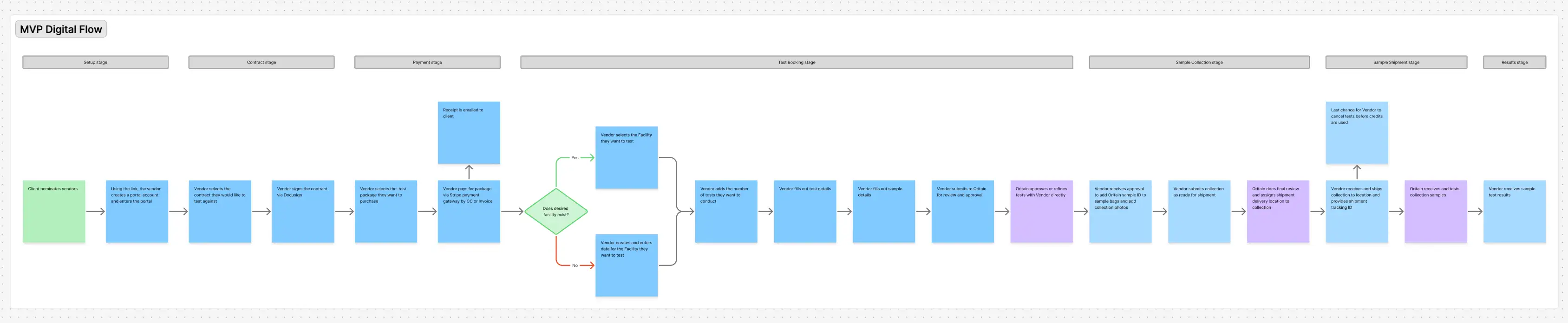
Oritain’s testing process followed a five-step journey: order test, define test, collect samples, test samples, return results.
In practice, the workflow lived across spreadsheets, shared folders, emails, and Teams messages, with each service delivery manager maintaining their own version. I described it internally as a “Wizard of Oz” UX test, a system that appeared software-like but was still coordinated manually behind the scenes. It had never been fully converted into a system where those human steps were designed out.
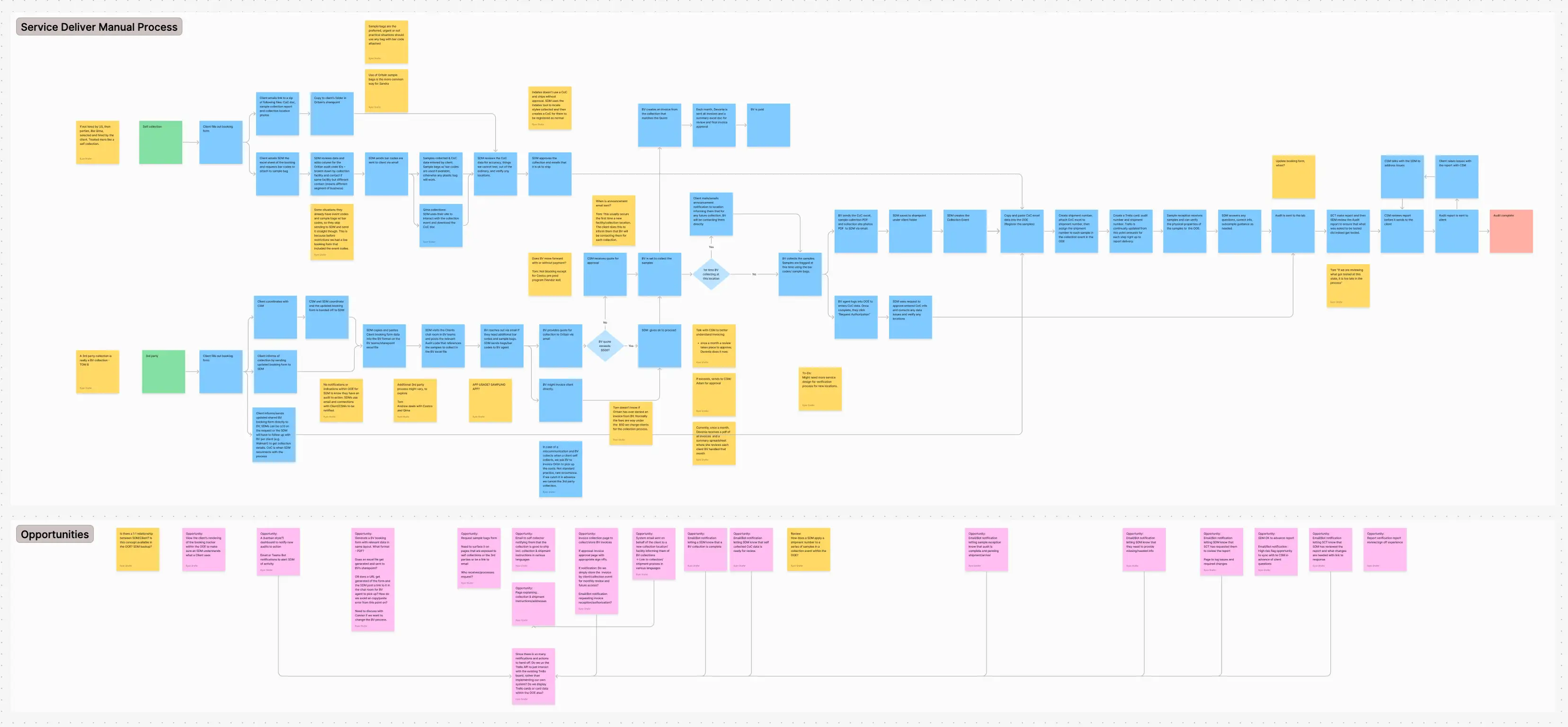
The opportunity was framed as digitizing the workflow into a self-service product for a new, scalable customer segment. After mapping the process and speaking with stakeholders, it became clear the real challenge was building something users could complete independently without introducing errors that would affect test quality.
The workflow spanned multiple departments with different priorities and operating models. A complete streamlining would have required organizational alignment beyond the project scope. Instead, I focused on a scalable structure that automated data capture where possible while preserving human verification where expert judgment was required.
Defining the Model
The most important design decision wasn’t the interface—it was the object model.
Through research and workflow mapping, I identified a consistent mental structure in how suppliers understood their businesses: contracts, facilities, and tests.
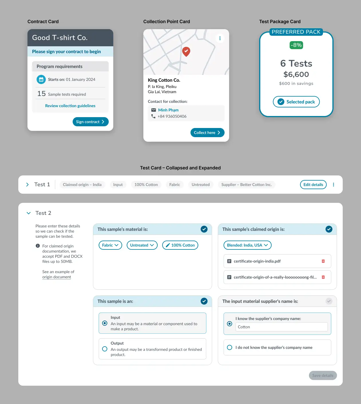
I structured the system around these three entities. Contracts represented commercial relationships, facilities represented manufacturing locations, and tests represented the individual testing activities tied to both.
This became the foundation of the information architecture.
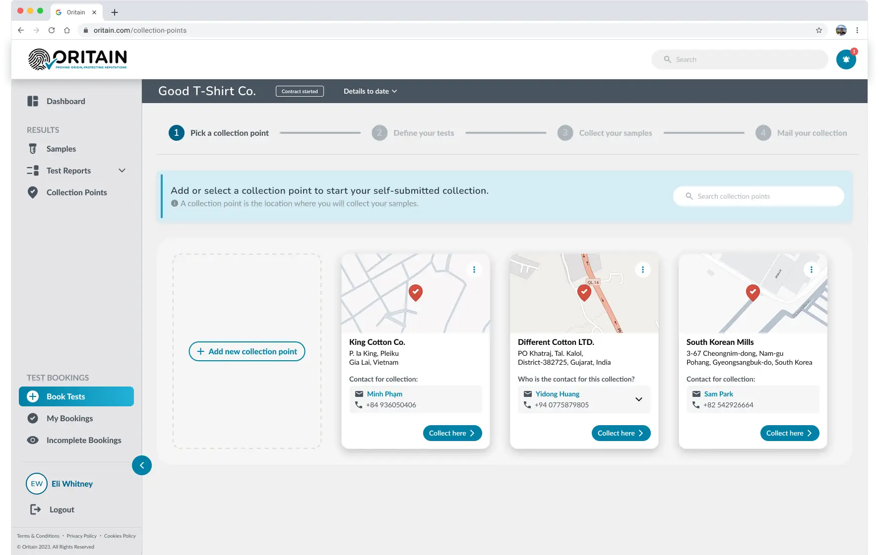
The system was designed so that if the model matched how users thought about their domain, the structure would require little explanation.
In testing, participants moved through the product without needing orientation or asking how it was organized, indicating the model aligned closely with their mental model and reduced interpretive friction.
Designing for a Global Supplier Base
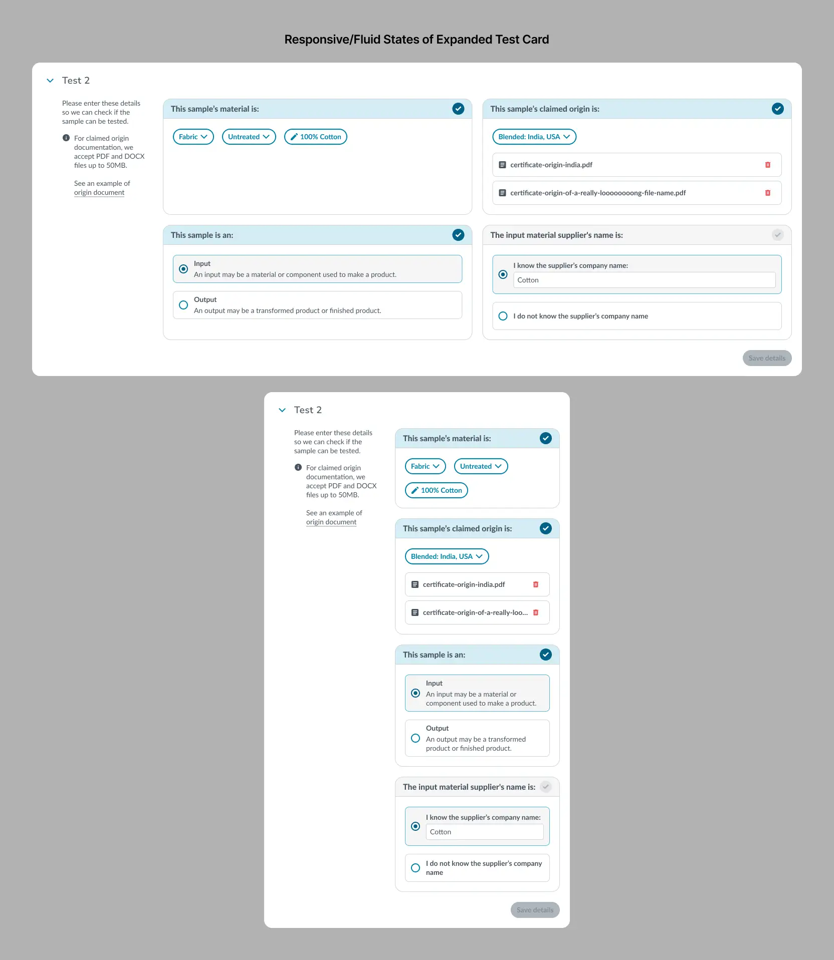
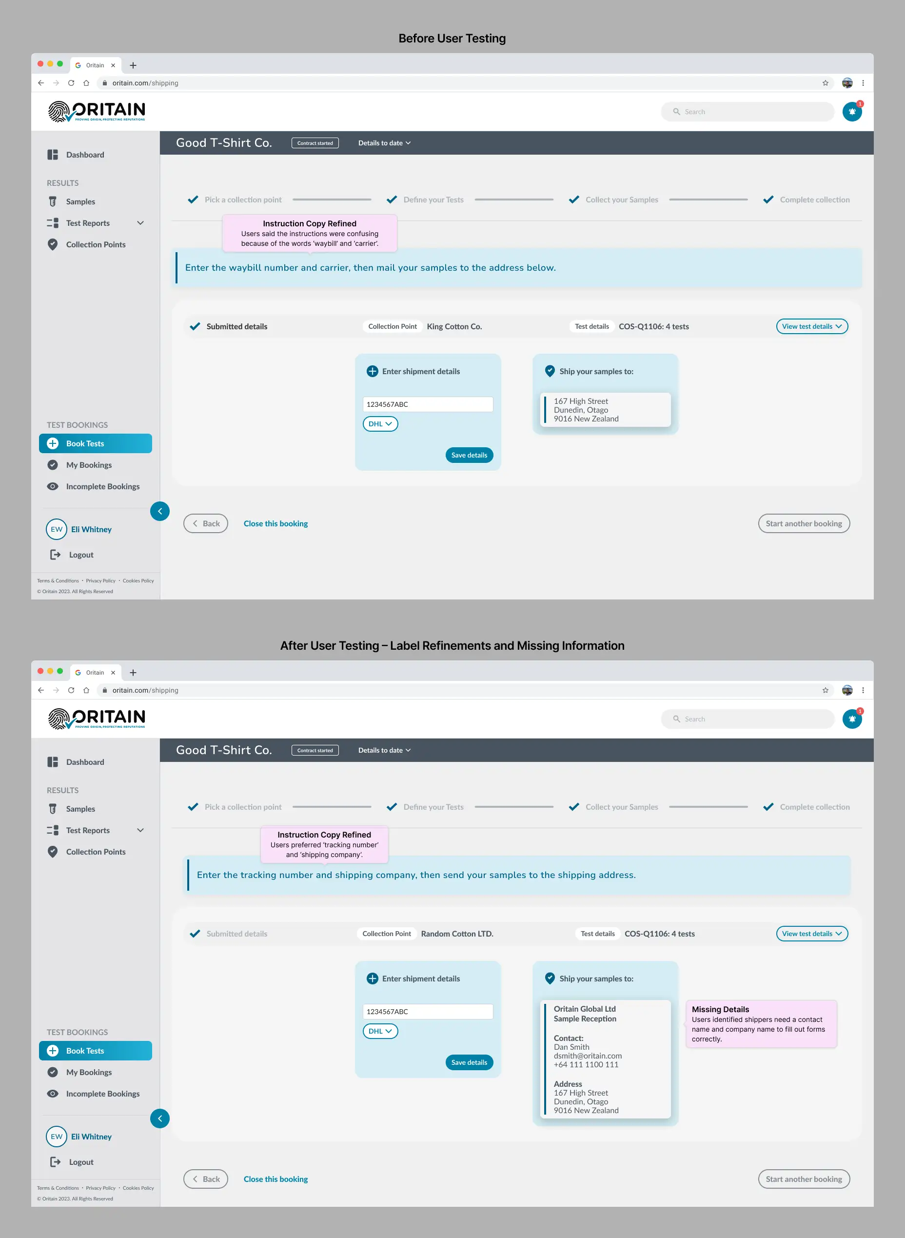
Many suppliers used English as a second language and were completing high-stakes data entry where misunderstandings could lead to costly errors, delays, or invalid tests.
In early usability testing, language and labeling were a primary source of failure. Users hesitated, misinterpreted terminology, or required clarification to proceed.
Localization was the long-term solution, but out of scope for MVP. I focused instead on simplifying product language systematically.
Before AI-assisted UX workflows were common, I built a custom GPT grounded in ESL and UX writing principles and used it to refine all product copy, including labels, instructions, and system messages.
For example, “Define your collection details” became “What are you testing?”
After these changes, task completion improved from ~70% to 100% in the second round of testing. Users moved through the workflow with fewer points of hesitation and reduced need for clarification, lowering the risk of costly mistakes in execution.
Adapting to a Major Business Change
Midway through the project, two structural changes reshaped the system design.
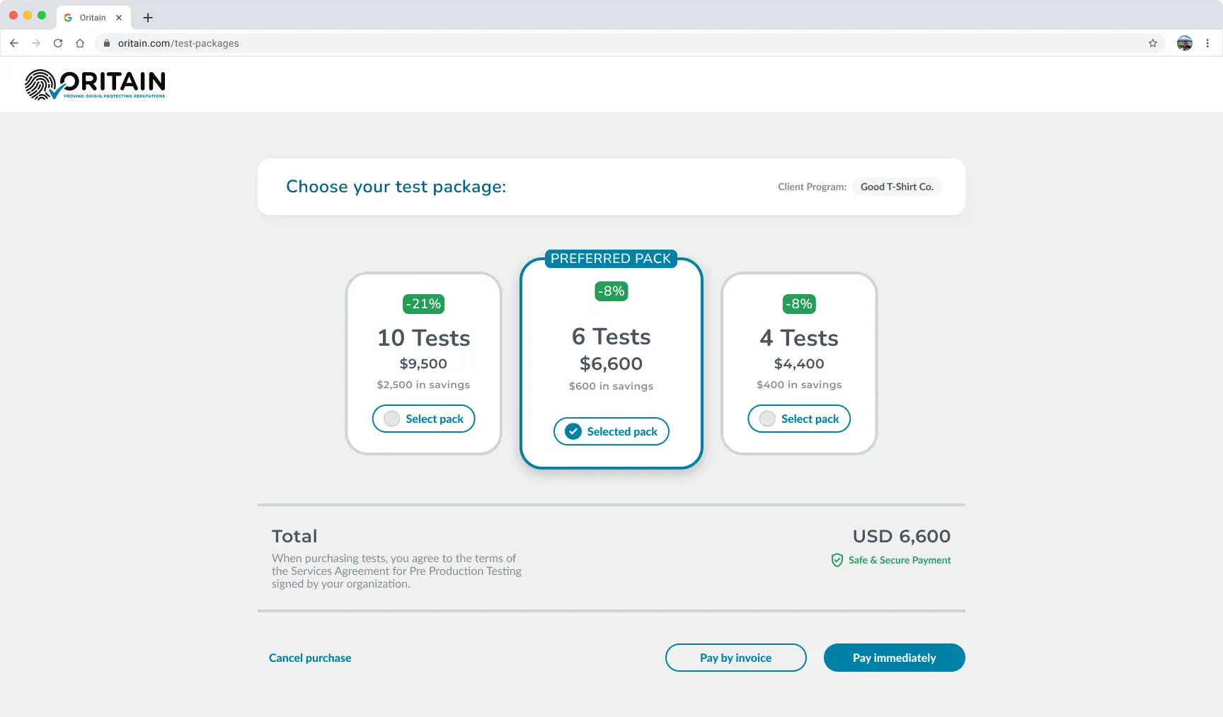
The first was a shift in the commercial model. Leadership replaced the shopping-cart approach I had recommended with a bundled credit system aimed at standardizing purchasing across customer segments.
While the cart model matched supplier behavior—small, task-based purchases on short timelines—the new model was designed for consistency with enterprise customers purchasing at scale under long-term contracts.
I raised concerns about the added complexity for suppliers, given the nature of their workflows. The business ultimately proceeded with the credit system.
This introduced new requirements across the purchasing flow:
- Credit balances
- Package purchasing
- Mid-flow purchase states
- Package management rules
- Additional edge cases throughout the workflow
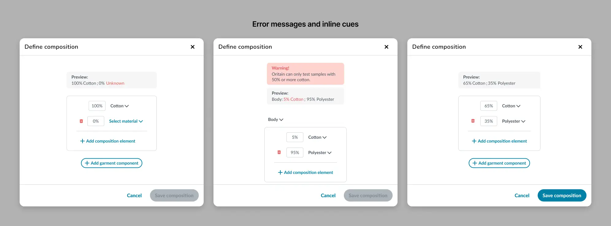
The second change emerged during implementation. While science decisions were not defined as formal rules, engineering had already implemented a strict data schema with defined types and validation requirements. Inputs initially treated as free text had to be rebuilt as structured forms with enforced constraints and validation states aligned to the backend model.
Both changes had to be delivered under tight timelines, without disrupting the existing workflow, while keeping the interface usable for non-technical users entering complex structured data.
Outcomes
The platform launched with measurable improvements in usability, data quality, and operational efficiency.
Results included:
- 100% task completion in pre-launch testing, up from ~70%
- Reduced data entry errors and duplicates through structured input and validation
- A modular architecture that supported post-launch expansion without redesign
- Contributed to securing one of Oritain’s largest client contracts
A key client later noted:
Suppliers report the portal being easy to navigate, with timely guidance and efficient troubleshooting. We are very pleased with this demonstration of commitment to the customer experience.
Reflection
The most important lesson from this project wasn’t about interface design.
Where decision-making exists as expert judgment rather than defined rules, it limits how much of the system can be automated. Human verification becomes part of the workflow not because of the UI, but because the underlying logic is not explicit enough to remove it.
That sets a ceiling on scalability. Further improvement depends less on interface iteration and more on turning implicit knowledge into shared rules that can be implemented directly in the product.
The second lesson was about influence.
I raised concerns about the payment-model change from a UX perspective. The issue wasn’t the argument itself, but that it stayed within a UX framing rather than becoming cross-functional. The decision required alignment across product, engineering, operations, and leadership.
In this case, the tight timeline led me to believe broader alignment wasn’t possible before the decision was made.
A more effective approach would have been to take the time to build cross-functional alignment earlier and frame tradeoffs as system-level costs rather than UX impact alone.
As design becomes more closely intertwined with business systems, the challenge shifts from improving interfaces to shaping how decisions are made.