Optimizing the Sign-Up Funnel at Showmax
At a Glance
My Role
Head of UX (acting hands-on IC for this project)
Problem
I had just joined Naspers to lead design at its subsidiary, Showmax, when I discovered their newly redesigned signup funnel was underperforming. Despite significant investment, trial conversion—the core growth metric—remained flat. The question was simple but urgent: why wasn’t it working?
Impact
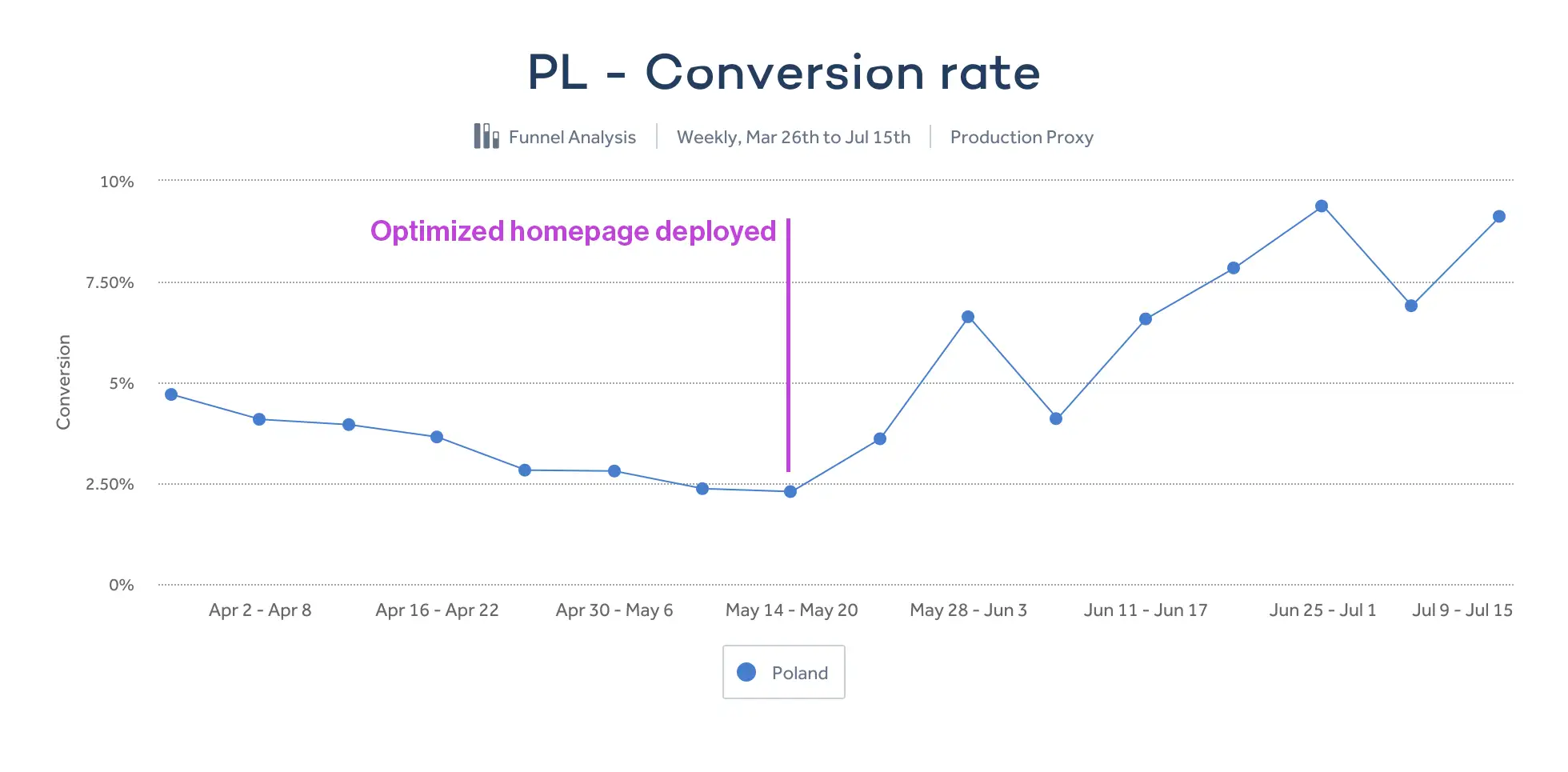
Homepage optimizations drove a clear lift in conversion rates. Additional opportunities and solutions were identified to push metrics even higher, ready for implementation when prioritized by Product.
Key Insight
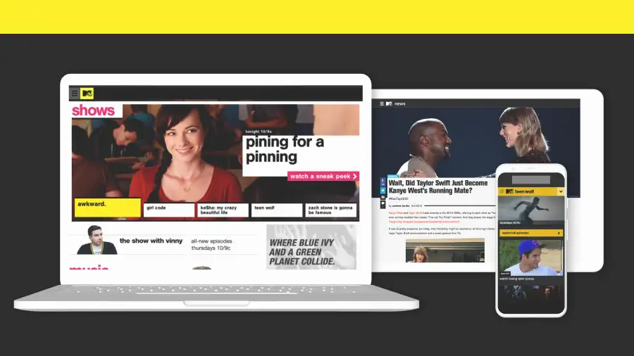
The design team focused on the signup flow but overlooked the broader user journey. Showmax’s homepage took nearly 25 seconds to load—an unacceptable experience, especially on mobile. Further along the journey, during the two-week trial, promoted content stayed static due to limitations in the recommendation engine—failing to engage users when it mattered most.
Approach
I diagnosed key performance issues using Lighthouse and analytics, then drove frontend optimization. Next, I worked with engineering to fast-track personalization during the trial—ensuring users saw relevant, dynamic content from day one.
Timeline
- Few days examining the issue
- 1 week of discussions
- 2 weeks to rearchitect homepage
Overview
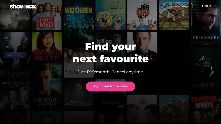
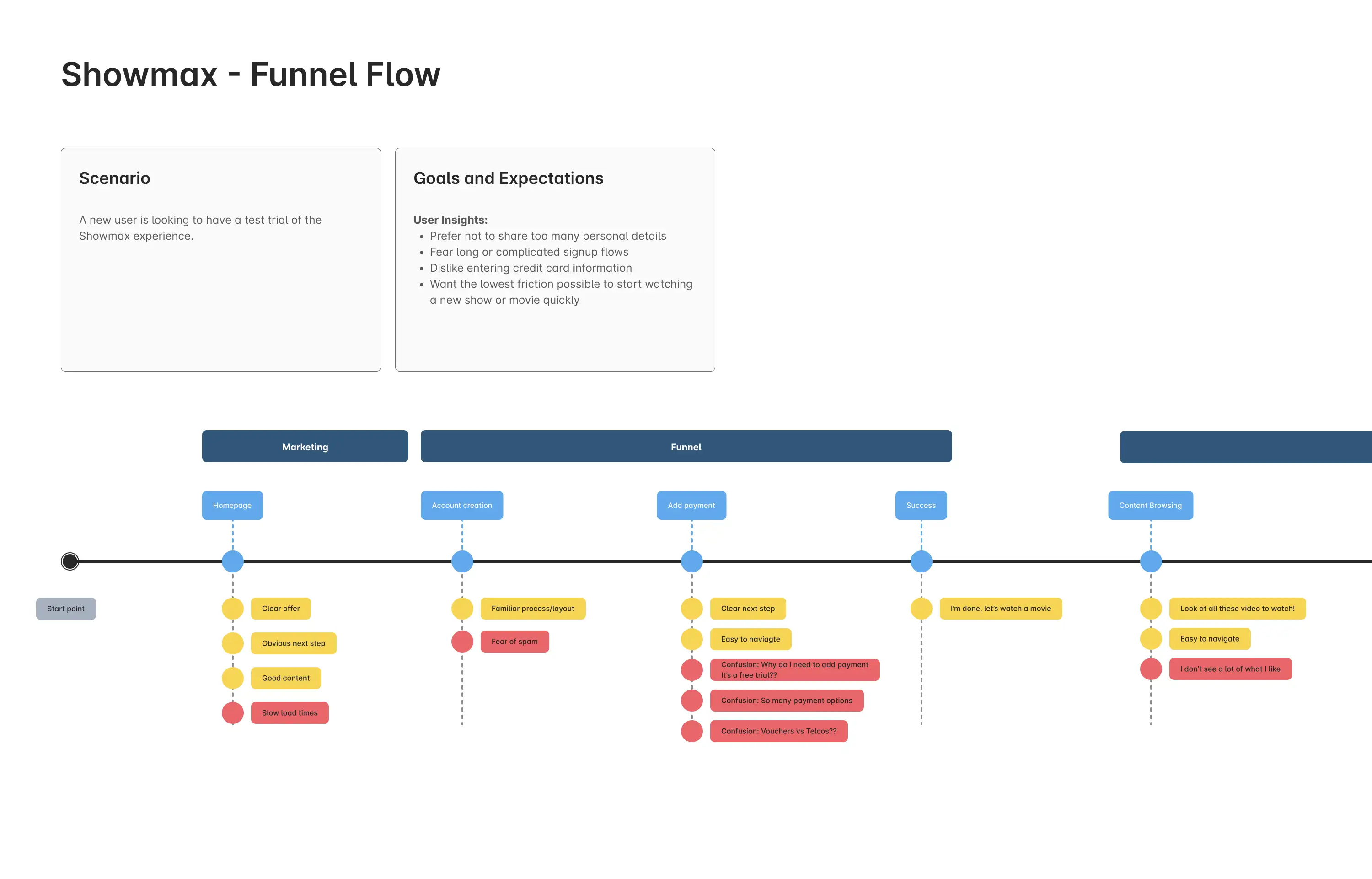
When I joined Showmax, the team had recently launched an improved sign-up flow — but results lagged expectations. I approached the problem as a hands-on IC, mapping the funnel as a holistic user journey rather than a narrow form flow.
That shift in perspective revealed overlooked UX and performance issues that were quietly undermining conversion rates.
Challenge

The team had focused narrowly on the sign-up form itself as the funnel experience. But in practice, users were dropping off much earlier: the homepage. Without a journey-level perspective, the root causes of low conversion remained hidden.
Analytics and heuristics revealed:
- Slow performance — homepage load times of ~25 seconds, especially damaging for mobile.
- High bounce rates — users abandoned before entering the funnel.
- Weak trial-to-paid conversion — new users weren’t seeing enough relevant content during their two-week trial to find value in paying.
Hypothesis 1: If homepage load times decreased, fewer users would bounce—leading to more users entering the funnel and, ultimately, higher trial conversion rates.
Hypothesis 2: If the recommendation engine surfaced more relevant content throughout the trial, users would perceive greater value in the service—leading to higher trial-to-paid conversion rates.
Approach
1. Diagnose with a Journey Lens
I mapped the funnel from first visit to trial value. Using Amplitude analytics, heuristic analysis, and Lighthouse audits, I identified:
- The homepage architecture was the root cause of high bounce rates. The frontend lead explained that the full React app—needed for the signup funnel—was also loading on the homepage, an unnecessary architectural choice that introduced massive latency and slow load times.
- I noticed some trial users were watching less video than paid subscribers—when logic suggested the opposite. In my own test, the homepage never changed—no recommendations appeared. The recommendations lead confirmed the engine needed a full month of data to personalize content—well beyond the two-week trial.
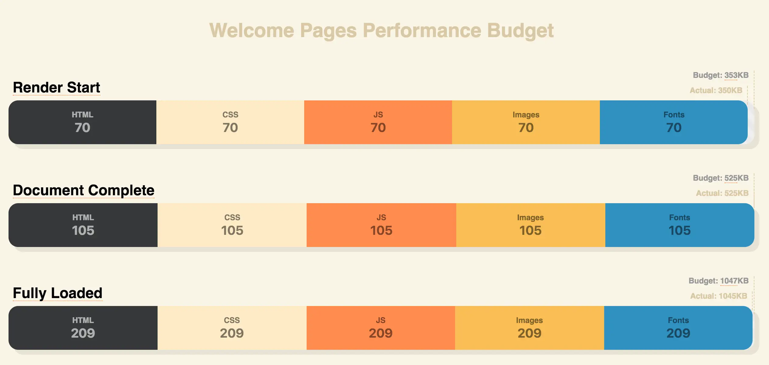
2. Collaborate on Performance UX
We worked together to re-architect the homepage as a lightweight entry point. This reduced load times from ~25 seconds to milliseconds. We also agreed on a shared performance budget to keep UX efficiency sustainable.
3. Extend the Funnel to First Value
After addressing performance, I analyzed the onboarding journey and uncovered another key issue: trial users weren’t shown any recommended content during their trial period.
This meant the main screen remained static throughout the trial. Content only changed if a producer manually updated it for that region. The recommendation engine required weeks of behavioral data—far longer than the trial window—resulting in stale, less engaging content.
I partnered with the tech lead on recommendations to explore quick technical wins that could deliver relevance sooner. This led to the idea of priming the recommendation engine at signup—giving it enough starter data to generate meaningful suggestions immediately.
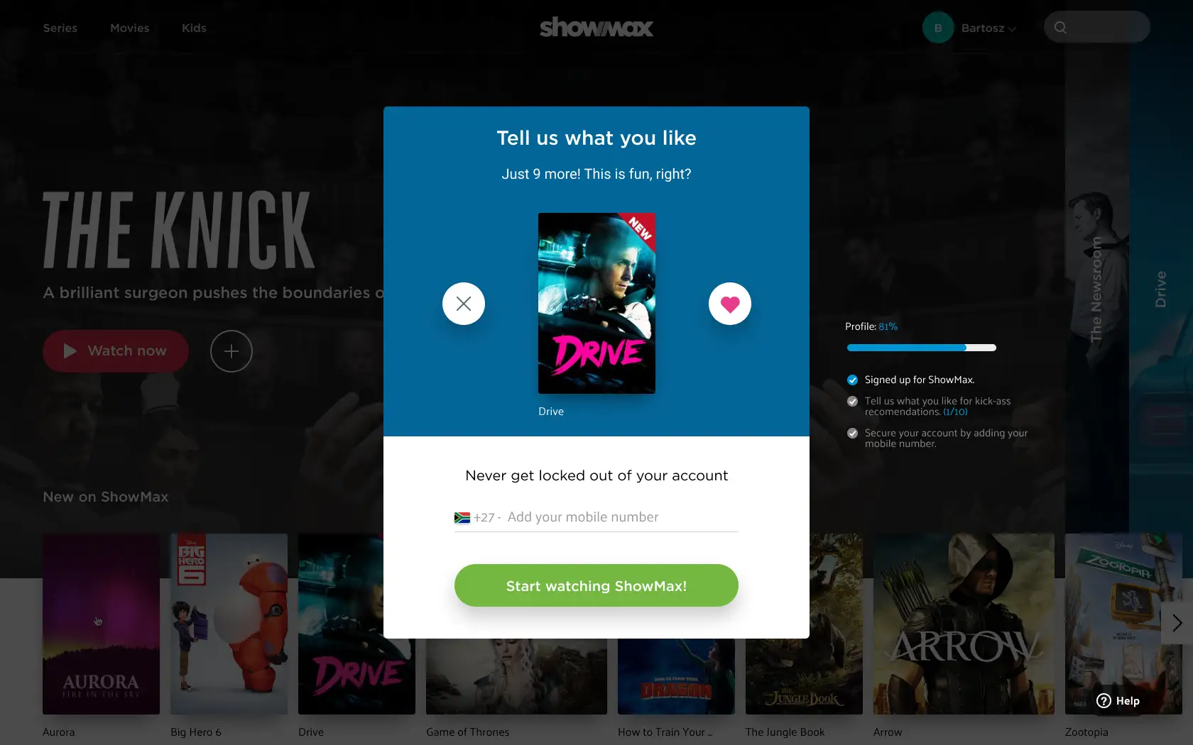
4. Prototype “Recommendation Priming”
Guided by hypothesis #2, we explored a lightweight onboarding step where new users selected shows or genres they liked. This gave the recommendation engine starter data, enabling immediate personalization and increasing perceived relevance during the trial period.
The prototype tested positively with users and was deemed technically viable by engineering. While shifting product priorities prevented its launch, it left us with a validated, ready-to-ship solution—available to deploy if increasing conversion rates became a priority.
Outcomes
- ↓ Load time: Reduced homepage load by 99%, from ~25 seconds to just milliseconds.
- ↑ Conversion: User trial conversion rate improved 3.6×, reaching 9%.
- ↑ UX framing: Shifted org perception of the funnel from “form-only” to full lifecycle experience.
- ↑ Relevance: Delivered a validated priming concept that improved trial engagement in testing.

Reflection
While working as an IC on this effort, the project reinforced key lessons I later shared with the broader team:
- Performance is UX — slow load times are the experience, and they kill engagement before content appears.
- Think beyond the form — funnels succeed when mapped as journeys, not just transactions.
- Perceived value matters — users need to feel relevance within minutes, not weeks.
Not every solution shipped, but the measurable gains and validated concepts showed how applying end-to-end UX thinking can drive meaningful impact.