Leading MTV’s Responsive Redesign – UX Strategy at Scale
At a Glance
My Role
UX Lead & Design System Strategist
Problem
MTV’s digital ecosystem was fragmented across desktop and mobile, leading to inconsistent user experiences, redundant workflows, and technical inefficiencies.
Impact
- Launched MTV’s first responsive design system — unlocking major engagement and traffic gains
- Extended the tokenized platform — enabling speed, consistency, and cross-brand efficiency
- Pioneered new cross-team workflows — reshaping how design and engineering collaborated
- Opened mobile and social pathways — fueling discovery, sharing, and exponential audience growth
Key Insight
A simple redesign wouldn’t solve the problem—fixing the fragmentation required rethinking content, brand voice, design and technology systems, and social strategy through the lens of how fans actually experienced and shared MTV.
Approach
Led the UX strategy that unified MTV, VH1, CMT, and Logo under one responsive platform—aligning teams and advancing ad models, media handling, and brand expression.
Overview
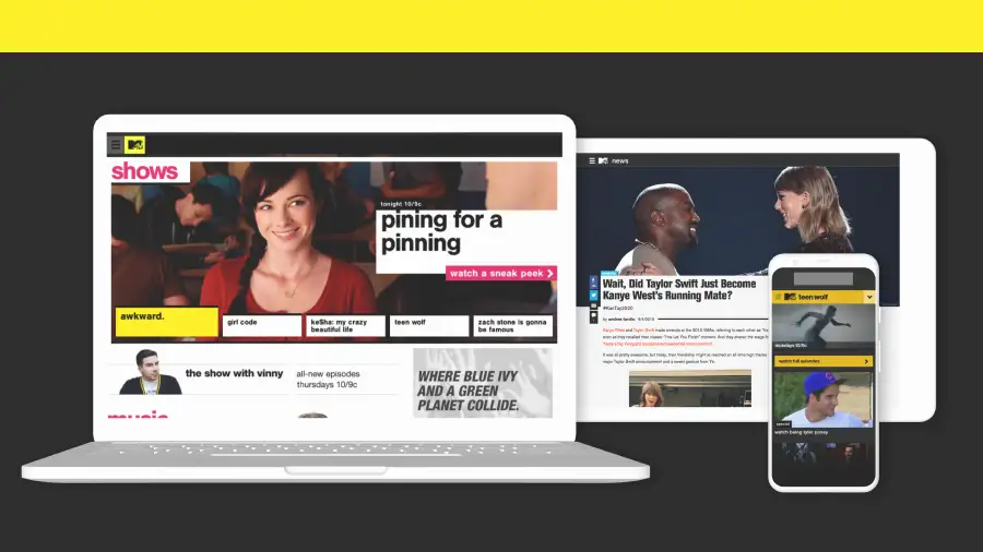
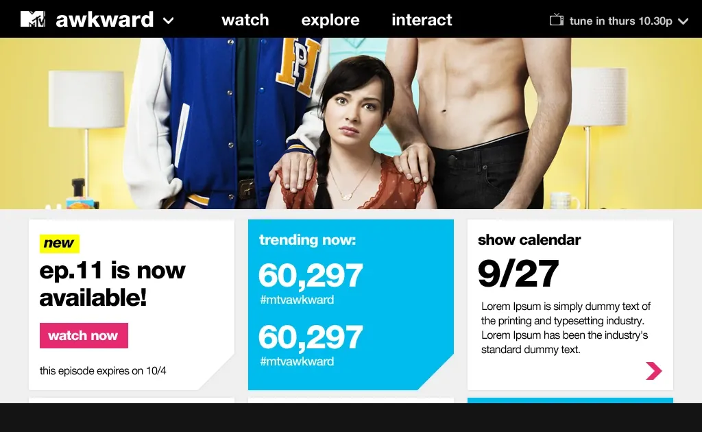
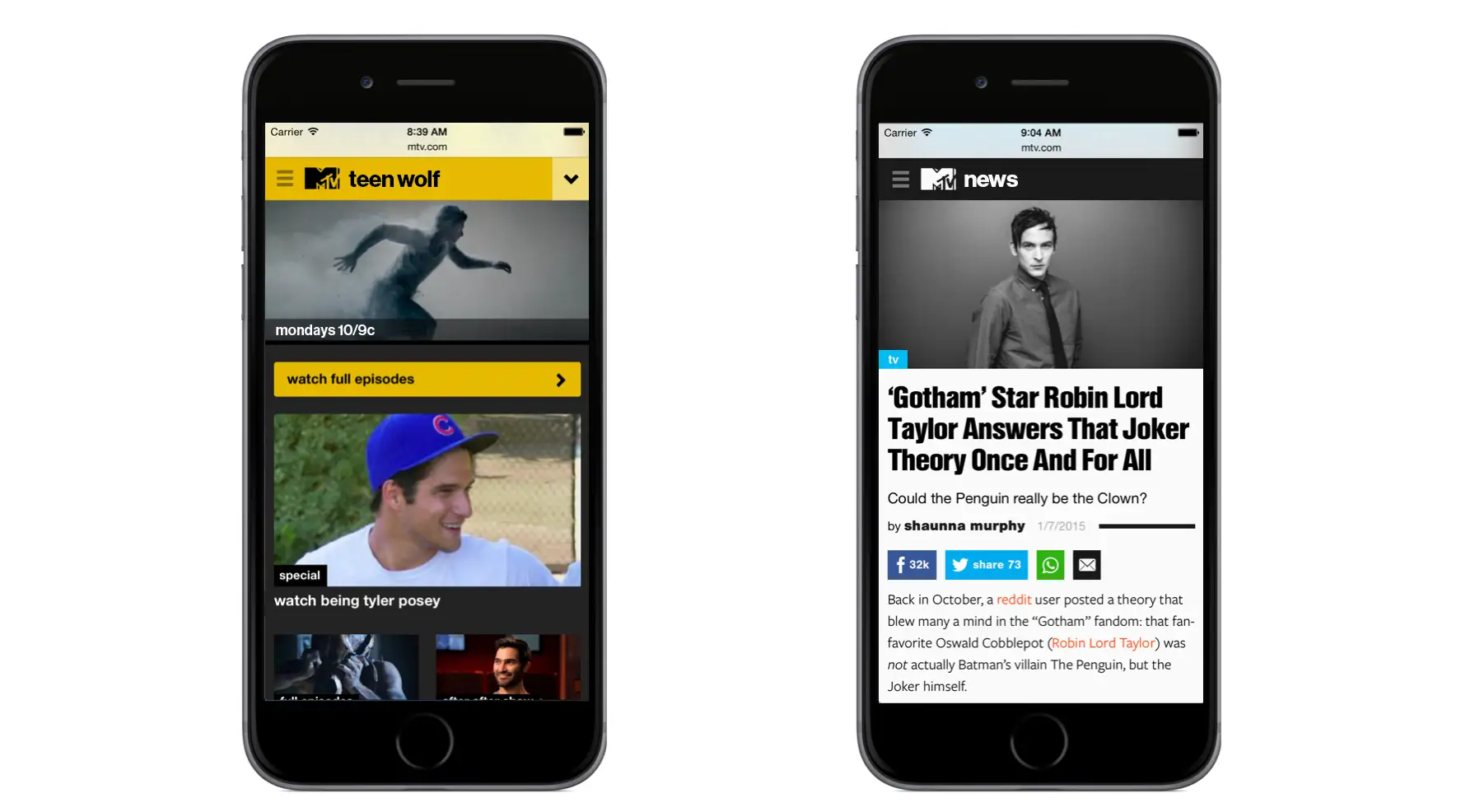
When I joined, MTV’s digital platforms were fragmented across devices, brands, and internal teams—resulting in disjointed experiences and bloated production pipelines.
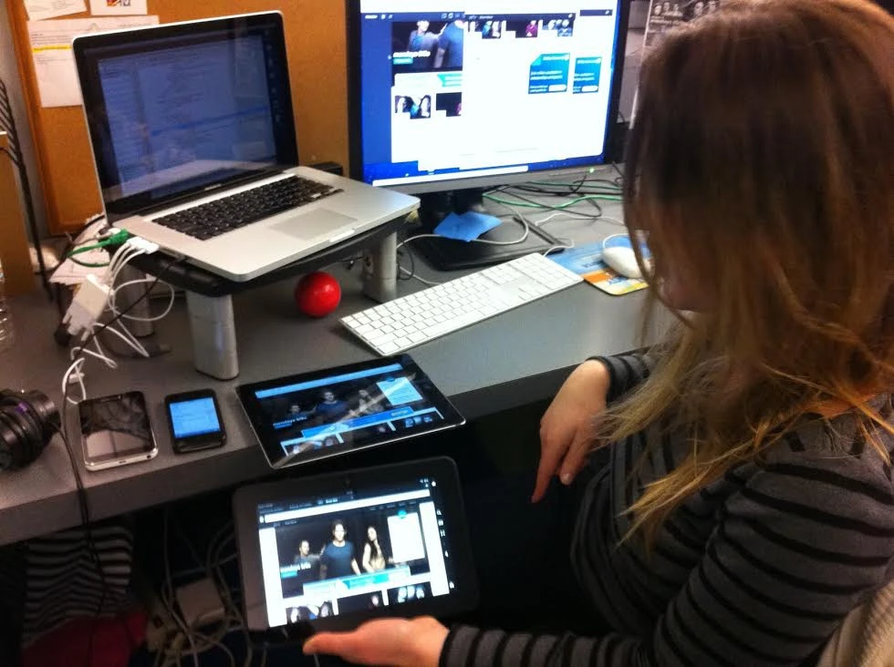
As Vice President of Design & UX, I led a ground-up redesign to unify MTV.com and its editorial properties under a responsive design framework—an emerging concept at the time, with few proven applications in large, ad-supported ecosystems.
Problem Framing
MTV’s digital products were split across desktop and mobile teams, each with their own codebases and ad models—creating disjointed UX and inefficiencies.
Heuristic reviews and user research confirmed the pain: desktop felt noisy and complex, mobile outdated and inconsistent. Users described the experience as “a mess to sort through.” To fix this, we needed more than a visual update—we had to unify design, content, and monetization across four brands.
UX Strategy & Execution
Evangelizing Responsive Design
To build support for responsive design, I led stakeholder education across executive, editorial, and ad sales teams—despite the lack of proven models at the time.
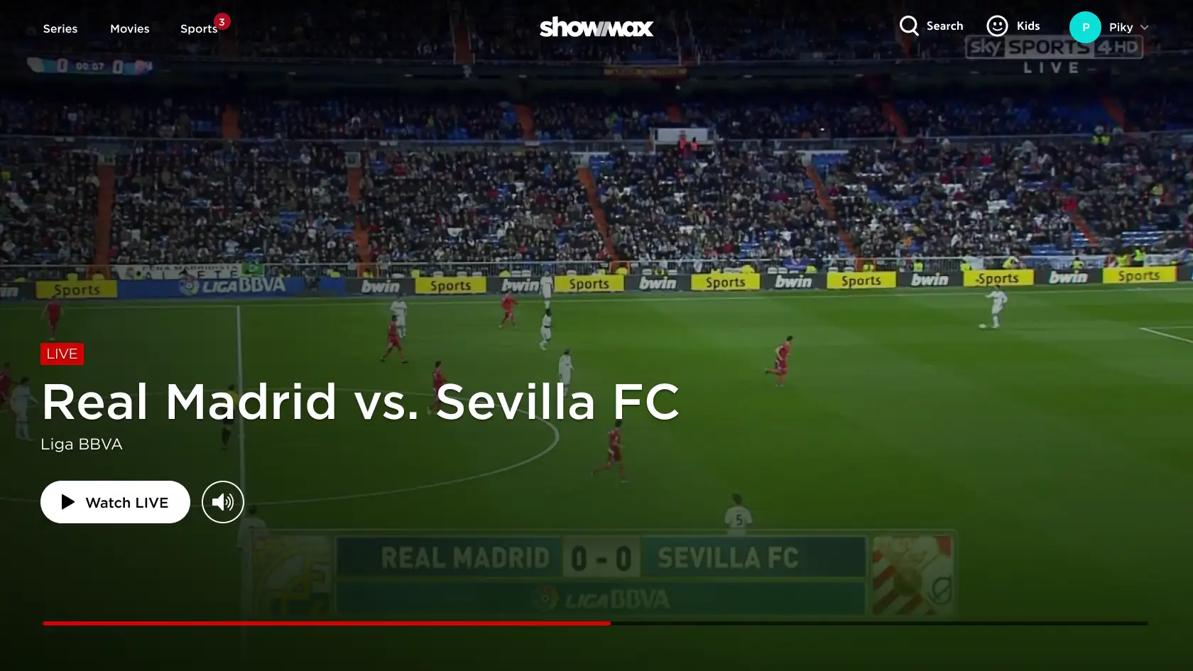
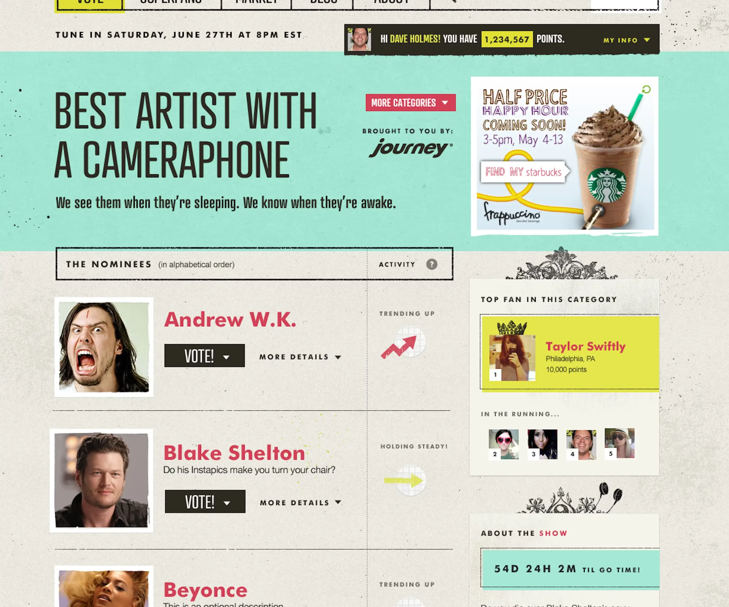
When the O Music Awards—a digital and social focused event—was greenlit, I successfully argued that being truly social-friendly meant putting mobile front and center. Responsive design was the only way to make that possible.
To de-risk the initiative, I partnered with Happy Cog, a design/dev firm experienced in responsive but new to MTV’s business. Together, we combined their technical expertise with our business context to prototype solutions that addressed both UX and monetization.
The result: a first-of-its-kind, ad-supported responsive site that became our internal proof of concept—resolving both technical hurdles and monetization challenges. It drove over 21 million user votes in 30 days (next year we doubled this to 42 million), won a Webby Award, and paved the way for MTV.com’s full responsive redesign.
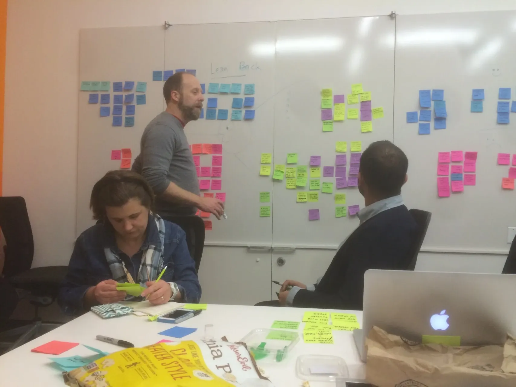
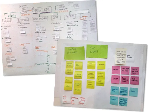
From Silos to Systems
At the time, designers and developers worked in silos, producing inconsistent UIs and slow rollouts. To change this, I partnered with the VP of Technology to launch a joint design system initiative. We paired:
- A product designer with front-end interest
- A front-end engineer with design instincts
Together, they identified reusable components, standardized HTML and class naming, enabled multi-brand theming, and built a central hub for assets and markup—an early precursor to modern design system documentation.
Scaling Across Brands
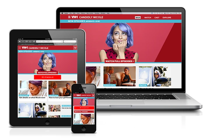
We expanded this foundation into a modular, cross-brand design system with shared HTML/CSS/JS components and token-based theming. This enabled fast prototyping, visual consistency, and rollout across MTV, VH1, CMT, and Logo—each with distinct brand needs.
One of the toughest challenges was responsive media. Legacy sites relied on fixed-pixel dimensions, which didn’t adapt across devices. I partnered with engineering to design an aspect-ratio–based cropping tool: producers uploaded a single high-resolution image, defined focal regions in standard ratios (1:1 for articles, 16:9 for video, 3:2 for galleries), and the system automatically generated and cached the necessary crops.
This streamlined workflows, maintained consistency, and allowed the system to scale responsively—well ahead of what most organizations were attempting at the time.
Content, Tone, and Layout in the Social Era
A major driver of the responsive redesign was aligning with MTV’s broader rebrand. Research showed that simply making pages responsive wouldn’t be enough—we had to speak in the audience’s voice, deliver content they cared about, and design with social sharing in mind.
We restructured the information architecture around three core pillars: Shows, Music, and Celebs. Every element—headlines, CTAs, promos—was rewritten to reflect the language, tone, and interests of the audience.
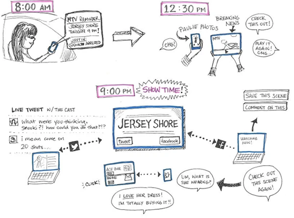
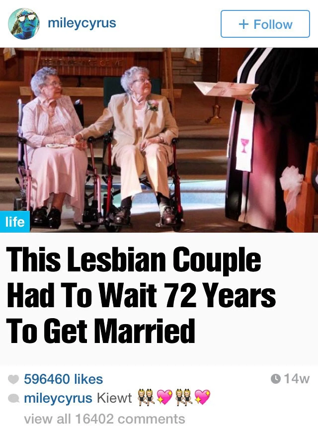
Informed by the highly social success of the O Music Awards and ongoing user research, layouts were crafted to be social-first. MTV News stories, for example, were designed to mirror the framing of an Instagram post—making them easy to screenshot and share. It worked: celebrities like Miley Cyrus began sharing posts in the same format.
Ad Strategy in a Responsive Context
Responsive design challenged the existing ad model. I worked closely with sales and engineering to prototype new ad placements and fluid layout behaviors that preserved monetization while maintaining design integrity. We then tested these approaches directly with advertisers, gathered feedback, and iterated to ensure the solutions were both user-friendly and commercially viable.
These responsive-friendly ad formats became sellable solutions for our partners and later a reference point across the Viacom portfolio.
Scaling UX Across Viacom
The redesign transformed MTV’s digital culture from fragmented execution to a unified, system-driven approach. Our modular design system became the foundation for future rollouts across the Viacom network. Teams adopted shared workflows, consistent branding, and repeatable UX patterns, enabling faster launches and higher-quality experiences at scale.
Measurable Outcomes
By overhauling MTV.com’s information architecture and branding—and implementing a responsive design system—we made the site more accessible, engaging, and easier to navigate.
Engagement Improvements:
↑ 151% increased page views per MTV News visit
↑ 137% increase in time spent on site
Mobile UX Gains:
↑ 92% mobile visits
↑ 297% time spent on mobile
↓ 11% exit rates across all devices
Social & Brand Reach:
↑ 565% referrals to MTV News
↑ 246% referrals to MTV Shows
In short, our realignment opened new pathways through social and mobile—drawing users into content, encouraging discovery, and fueling a share-driven consumption loop that dramatically increased traffic.
Our results were strong enough to draw attention from the wider UX community. Luke Wroblewski featured our data in a short article, helping spread MTV’s responsive design story beyond media circles.
Organizational Impact:
- Launched one of the web’s first responsive media platforms with integrated advertising—at a time when industry conversations around ad compatibility in responsive design had barely begun.
- Created a scalable multi-brand UX design system adopted across Viacom
- Pioneered advertiser-validated responsive ad solutions, iterating with partners to ensure solutions were both user-friendly and commercially viable.
- Broke down silos between design and engineering by pairing a designer with an engineer to co-create MTV’s first design system.
- Built and mentored a growing team, with alumni moving on to roles at Google, Twitter, and other major tech companies
- Won a Webby Award for work as part of the proof-of-concept responsive innovation
Reflection
This initiative taught me how UX could work in a large media organization. It required not just design expertise, but systems thinking, cross-functional negotiation, and storytelling to build buy-in and momentum.
While advancing this effort, I saw a critical gap in internal tools—editors and producers lacked the same design clarity we delivered to audience-facing products. With no dedicated resources, I often filled the gap myself, but knew that wasn’t sustainable.
The experience reinforced a key principle: UX must also serve internal teams, ensuring their workflows are as clear and efficient as the experiences we deliver to users. Once MTV News secured additional funding, I made it a priority to allocate dedicated UX support for internal tools and fill the gap.
Ultimately, this work shifted MTV’s digital strategy toward UX as a driver of both audience engagement and business value—and it shaped my approach to building more balanced, service-aware design teams in future roles.