Designing for Live: Two Bets on Growth at Showmax
At a Glance
My Role
Head of UX (acting hands-on IC for these projects)
Problem
Naspers/Showmax wanted to expand its audience by betting on live content—first with Saturday Night Live in Poland, then with live sports. Both required fast UX strategy, rapid iteration, and careful balancing of marketing ambitions with conversion and usability goals.
Impact
- Led strategic design solutions for both initiatives.
- Resolved marketing vs product conflicts through quantified A/B testing, agreeing on a –10% conversion tolerance; the SNL promo variant landed at –8.32%, within target.
- Delivered a content-forward, data-driven sports experience approved as the future live platform.
Key Insight
The success of live content—and its impact on user growth—depends on two key factors: the cultural relevance of the content and how easy it is to find and watch. Both of Showmax’s live initiatives had to perform against these complexities to succeed.
Approach
I united teams through clear guardrails and rapid experiments, using cultural insight and real data to drive scalable design decisions.
Timeline
A few weeks per project — fast-paced startup environment.
Expanding Reach Through Live Content: Two Bets, Two Design Challenges
To accelerate audience growth and improve sign-ups and retention, Showmax made a strategic bet on live content. As Head of UX, I led two critical initiatives under tight startup timelines—balancing marketing ambition with conversion, and transforming variable live sports data into a clear, scalable, multi-platform UI.
From many experiments at MTV, I learned live content only succeeds when it’s a can’t-miss cultural moment—like a concert or award show. Regular premieres rarely change behavior; users default to on-demand.
This became my lens for evaluating Showmax’s two live bets: Saturday Night Live in Poland, which I questioned whether it met that cultural threshold, and Live Sports, which aligned naturally—unlocking a clear growth opportunity.
Design Principles for Live Experiences
While designing Showmax’s growth-focused live experiences, I grounded my approach in a few key principles:
- Design with real data, not assumptions.
- Prioritize when layouts serve competing goals.
- Scalable outcomes come from repeatable, reusable design patterns.
- Design for adaptability across platforms.
Saturday Night Live: Mediating Marketing Ambition and Conversion Risk
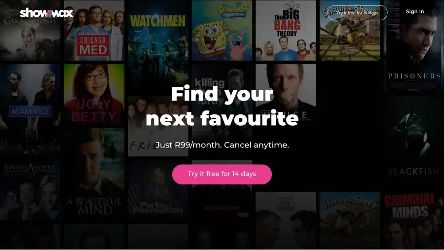
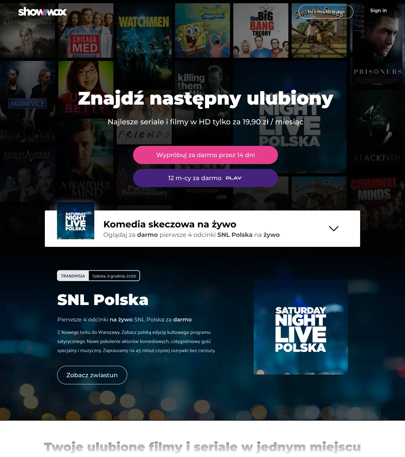
Over two fast-paced weeks, I led our three-person agency to make the homepage—not a new subpage—the primary entry point for SNL, maximizing visibility and organic traffic. This decision led to a responsive, state-based homepage layout tailored for live events—designed to promote content without undermining trial conversions, the homepage’s primary business goal.
Our initial design led to a major disagreement between a designer on my team and the Head of Marketing in Poland. Marketing wanted better promotion with the promo above the fold, while the design team feared that would cannibalize conversions.
I aligned Marketing and Product by negotiating an A/B test with a –10% signup conversion tolerance on the contentious design. This turned subjective debates into measurable guardrails and signaled UX maturity in balancing growth with conversion.
We tested two homepage variants:
- Version A prioritized conversions with the promo below the fold.
- Version B placed it above the fold, introducing competing CTAs.
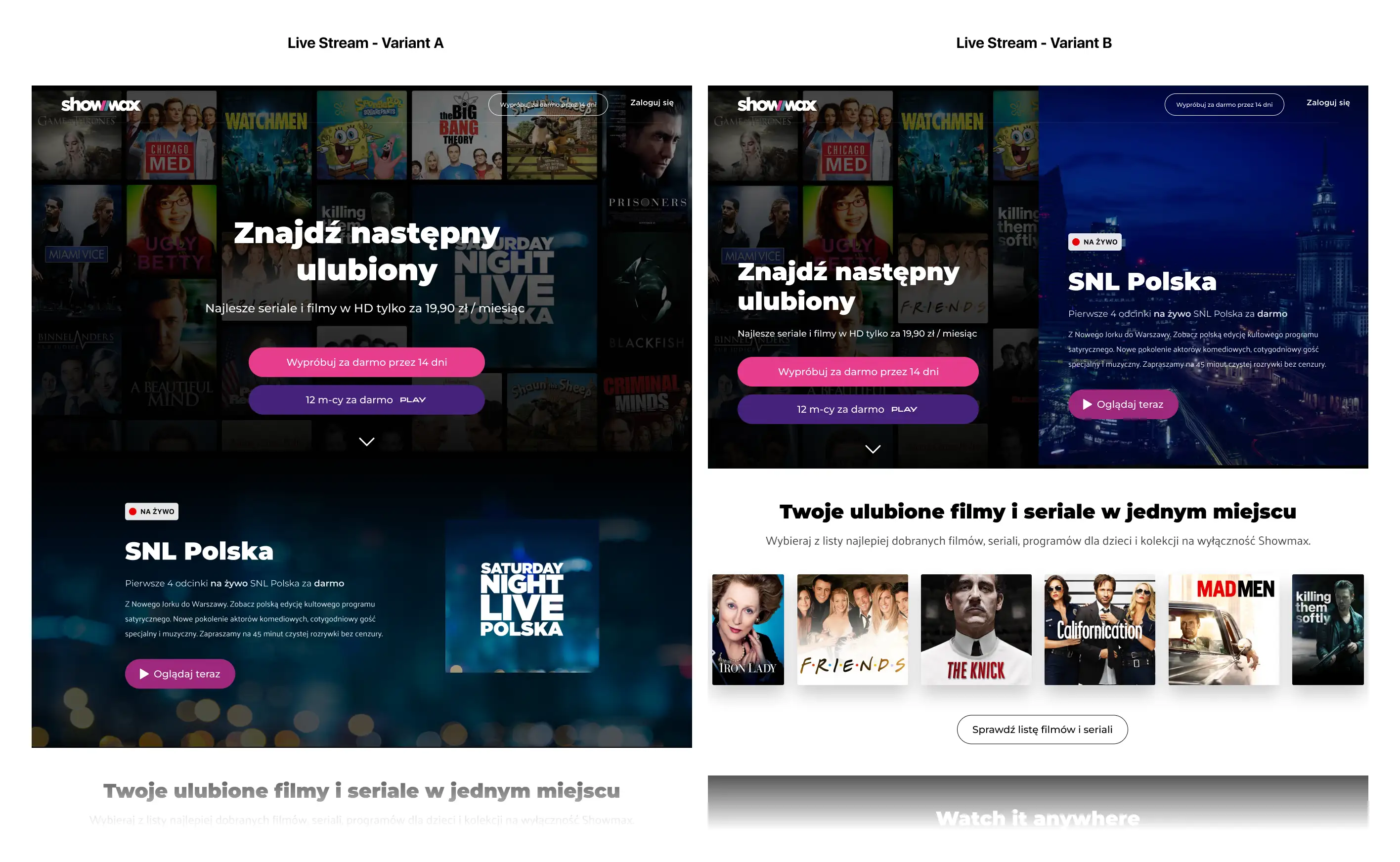
As expected, Version B saw a -8.32% drop in signups compared to Version A. Since this was within the agreed tolerance, Marketing accepted the trade-off, prioritizing louder promotion over conversion.
After the initial launch, I led further design experiments to explore layouts and messaging hierarchies that maintained promotional prominence while reducing conversion loss.
Even with a well-executed launch, the SNL initiative reinforced what my MTV experience had taught me: without a culturally must-see hook, live formats struggle to shift user behavior. Still, by mediating competing goals and using experimentation to manage risk, we balanced growth with conversion.
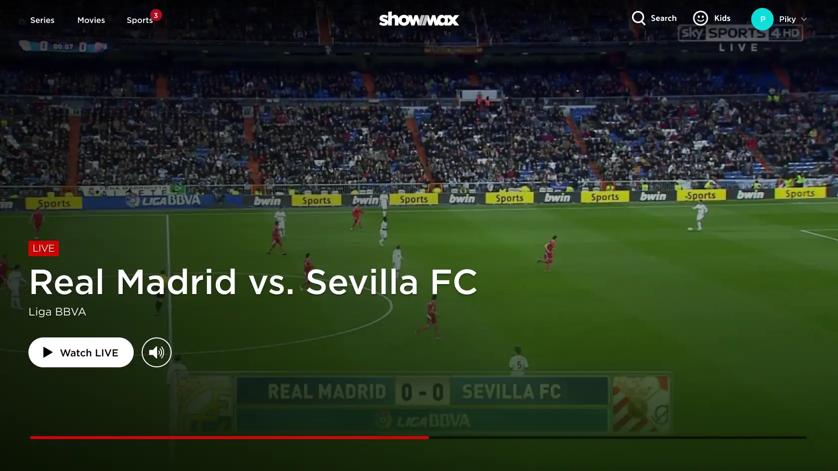
Sports: From Spreadsheet Mess to Scalable Multi-Platform UI
To further Showmax’s push into live content and growth, we chose to add live sports, which carried real cultural weight, but came with a complex, real-time dataset and tight timelines for delivery.
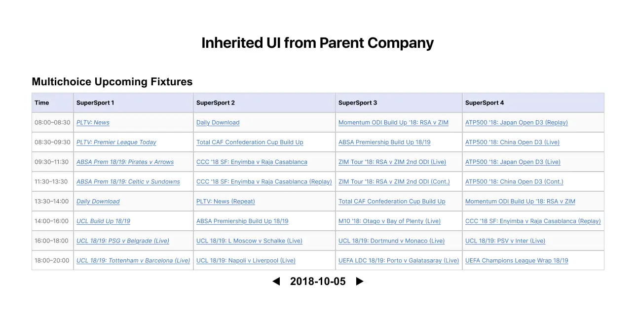
Showmax’s parent company had been developing a live sports solution within their own product, but their design team struggled to deliver a usable, scalable experience. Leadership asked me to take over as design lead and adapt it for integration into our platform.
Within three weeks, I organized our three-person design team by focus area—programming, filtering, search, and playback—spanning Web, TV, and Mobile. We worked in parallel, critiqued each other’s designs, and quickly iterated to produce one cohesive experience across platforms.
Real Data, Not Assumptions
As IC lead for cross-device content programming design, I grounded my approach in real data—not assumptions. The original team’s spreadsheet-style grid was difficult to navigate, poorly suited to multiple platforms, and based on the assumption of a full live schedule. Before designing a solution, I needed to understand the dataset for what it really was.
With only a content API available, I extracted the raw JSON and mapped it into spreadsheets to better understand the actual structure. It quickly became clear the dataset was too sparse for a traditional programming grid—most cells would be empty, resulting in a scroll-heavy experience on desktop and a painful one on mobile.
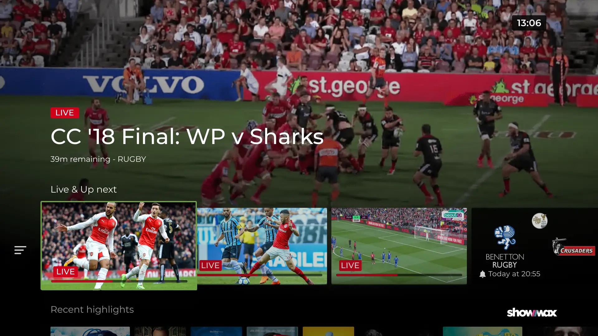
As a data-driven alternative, I reorganized the content into four time-based groups:
- What’s live now or starting soon
- Today Morning
- Today Afternoon
- Today Evening
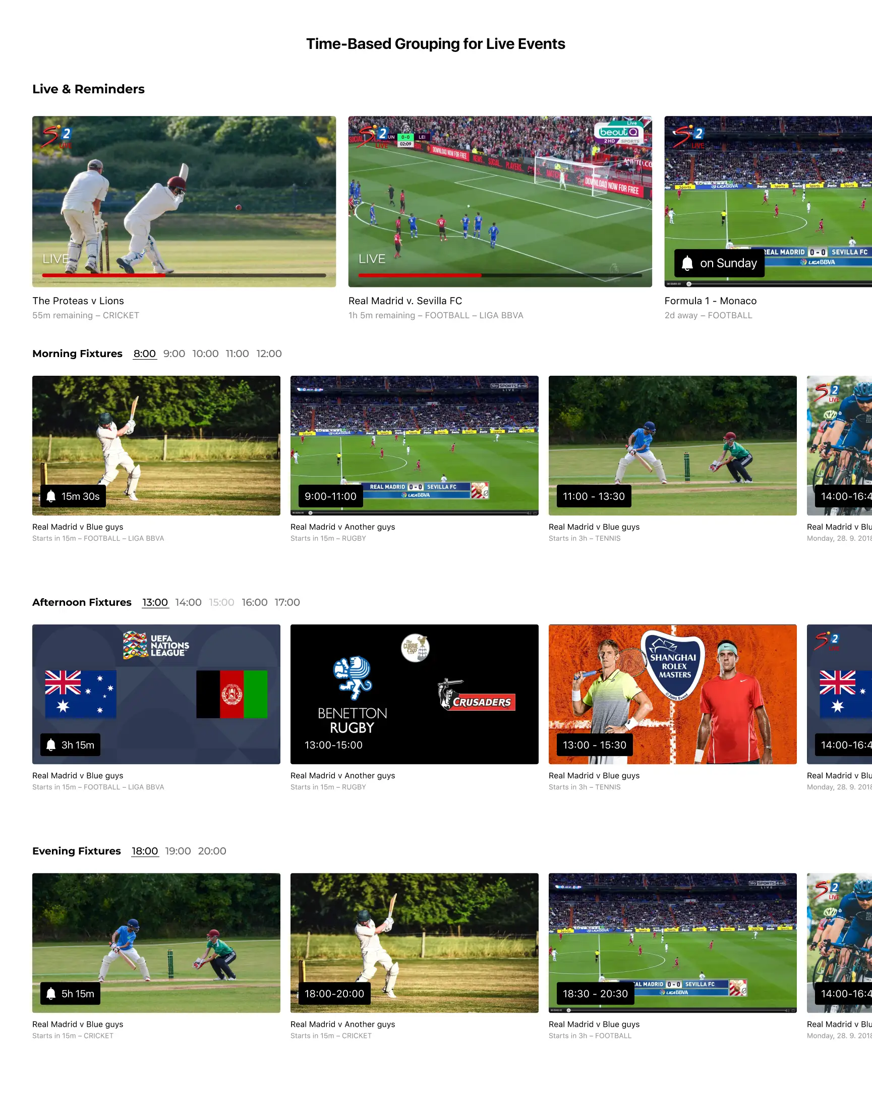
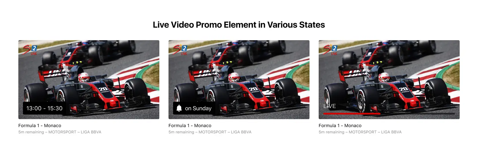
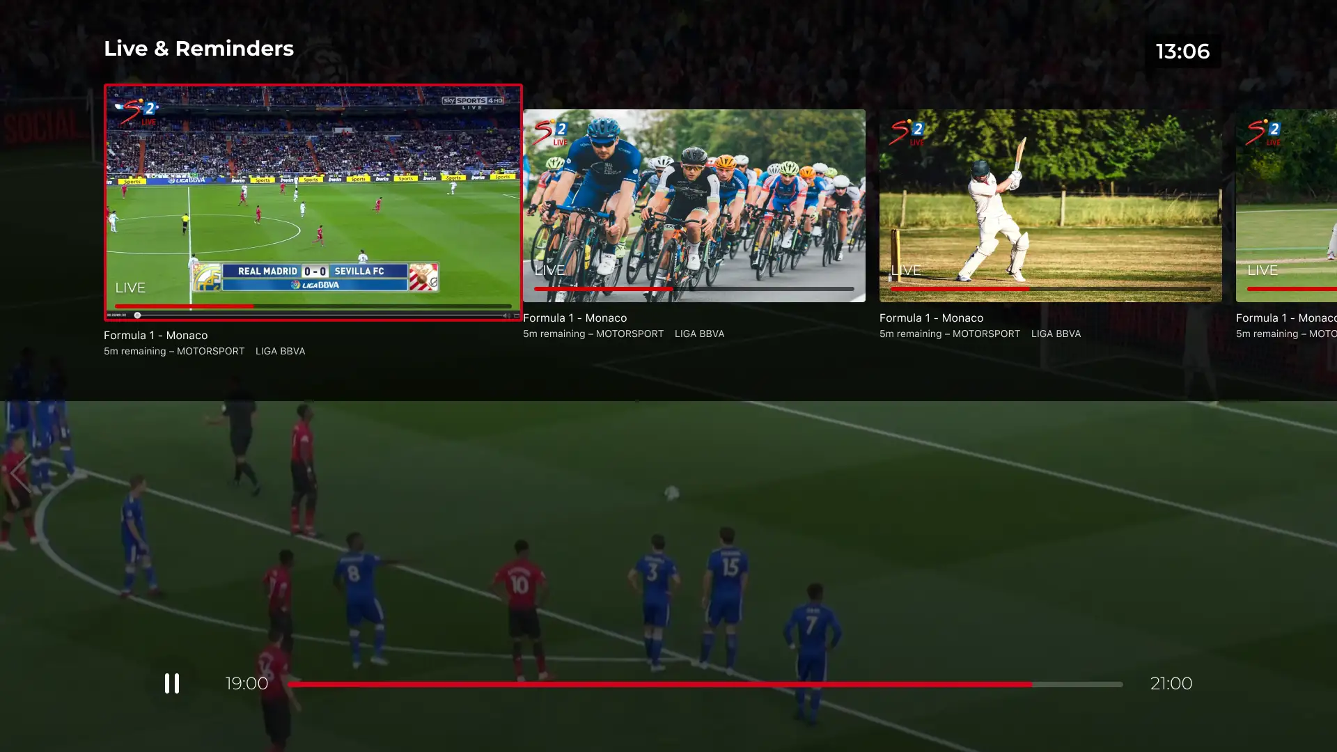
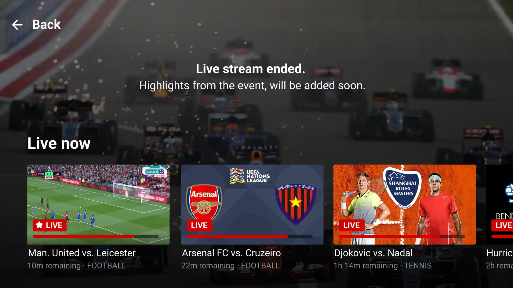
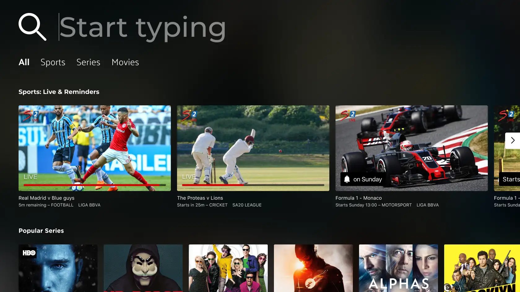
This structure enabled us to use familiar content rows that expanded or contracted based on need, with dynamic states like In Progress, Starting Soon, and Reminder—making the experience content-forward, intuitive to navigate, and scalable across devices. I especially valued how this solution extended our design system with a repeatable pattern, adaptable across the main sports section, video player pause states, and the broader Showmax product ecosystem.
Establishing a Scalable Foundation
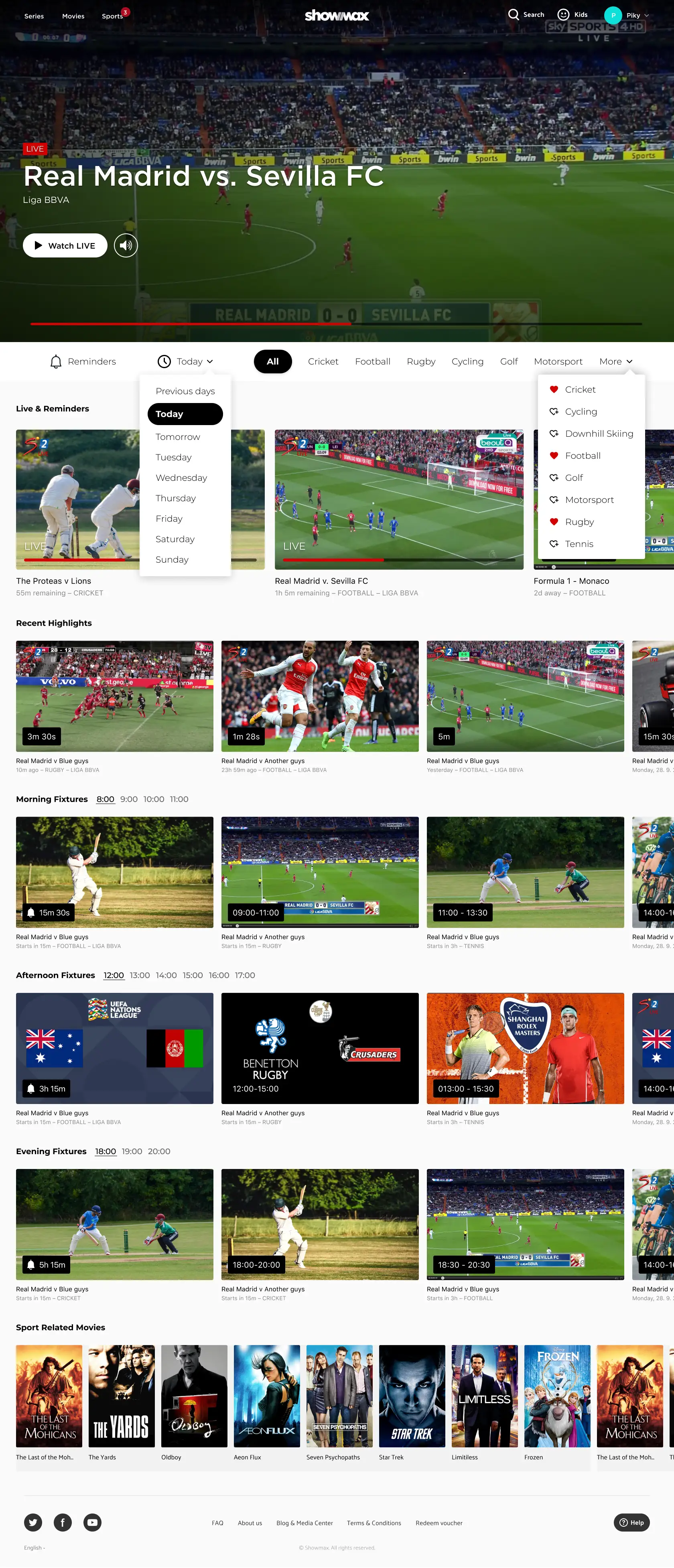
Though I left Showmax before launch, I handed off clear next steps to the design team—including lightweight guerrilla usability testing to catch unforeseen issues early. The design was approved as the future pattern across Web/TV/Mobile, which laid a strong foundation for Showmax’s future live sports platform—transforming a dense, spreadsheet-like concept into a scalable, content-forward experience consistent across devices.
Reflection: Designing for Culture, Data, and Trade-offs
These projects sharpened how I tackle complex UI challenges under real constraints—balancing cultural insight, marketing goals, and messy data to deliver scalable, content-forward systems.
- Cultural insight shapes success – Live works when content is can’t-miss.
- Data-driven mediation beats opinion – Guardrails and testing align teams.
- Taming messy data unlocks scalable systems – Interrogating structure early reveals patterns that scale.
Across both initiatives, I treated live content as a growth experiment—applying a UX lens early, using data to navigate ambiguity, and mediating competing goals to turn complexity into clear, testable, scalable UI systems aligned with user and business needs.